Norwegian Association of Elite Hockey Clubs (Norsk Topphockey)
Regarding a name change, we were contacted by Norsk Topphockey (former Elite Hockey) to design their new logo and identity. NTHs main purpose is to financially strengthen Norwegian elite hockey and hockey in general through a commercial cooperation.
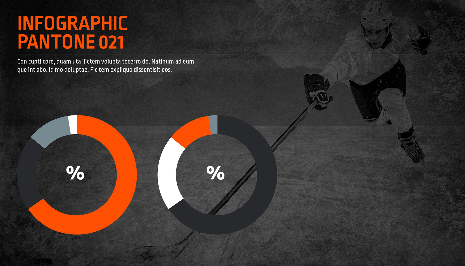
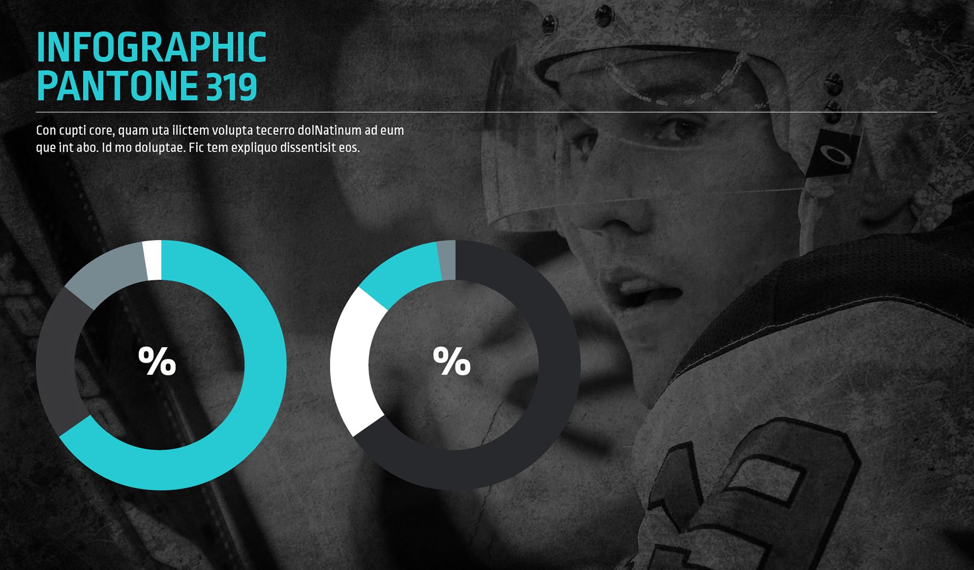
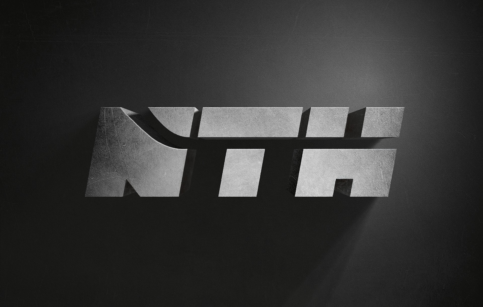
NTH wanted a strong and sturdy logo with clear associations to the sport. We focused on the abbreviation «NTH» and we used heavy typo, slightly slanted to illustrate speed. The shape of a hockey stick slices through the letters – which also enhance the feeling of motion. «NORSK TOPPHOCKEY» is set in a condensed and slim type to contrast «NTH». The palette consists of a warm black, icy blue silver, orange and turquoise – it’s limited and not favouring any of the teams. The logo is designed to function on various surfaces.