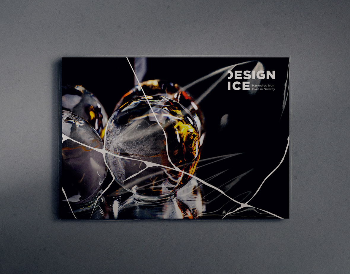
GRAATEN ETABLERET I1936
Graaten er navnet på et nytt senter for shopping, bolig og spising i en av Norges beste skidestinasjoner – Sjusjøen. Sjusjøen ligger i Hedmark fylke, kun 20 minutters kjøretur fra Lillehammer, stedet der vinter-OL ble arrangert i 1994.
Graaten har vært et knutepunkt for handel og et sted for skiløpere og turister å få seg en rask matbit siden 1930-tallet. Opprinnelig var det en seter, der bøndene pleide å bringe buskapen sin om sommeren for å melke dem etter en dag med beite i fjellbeitene.
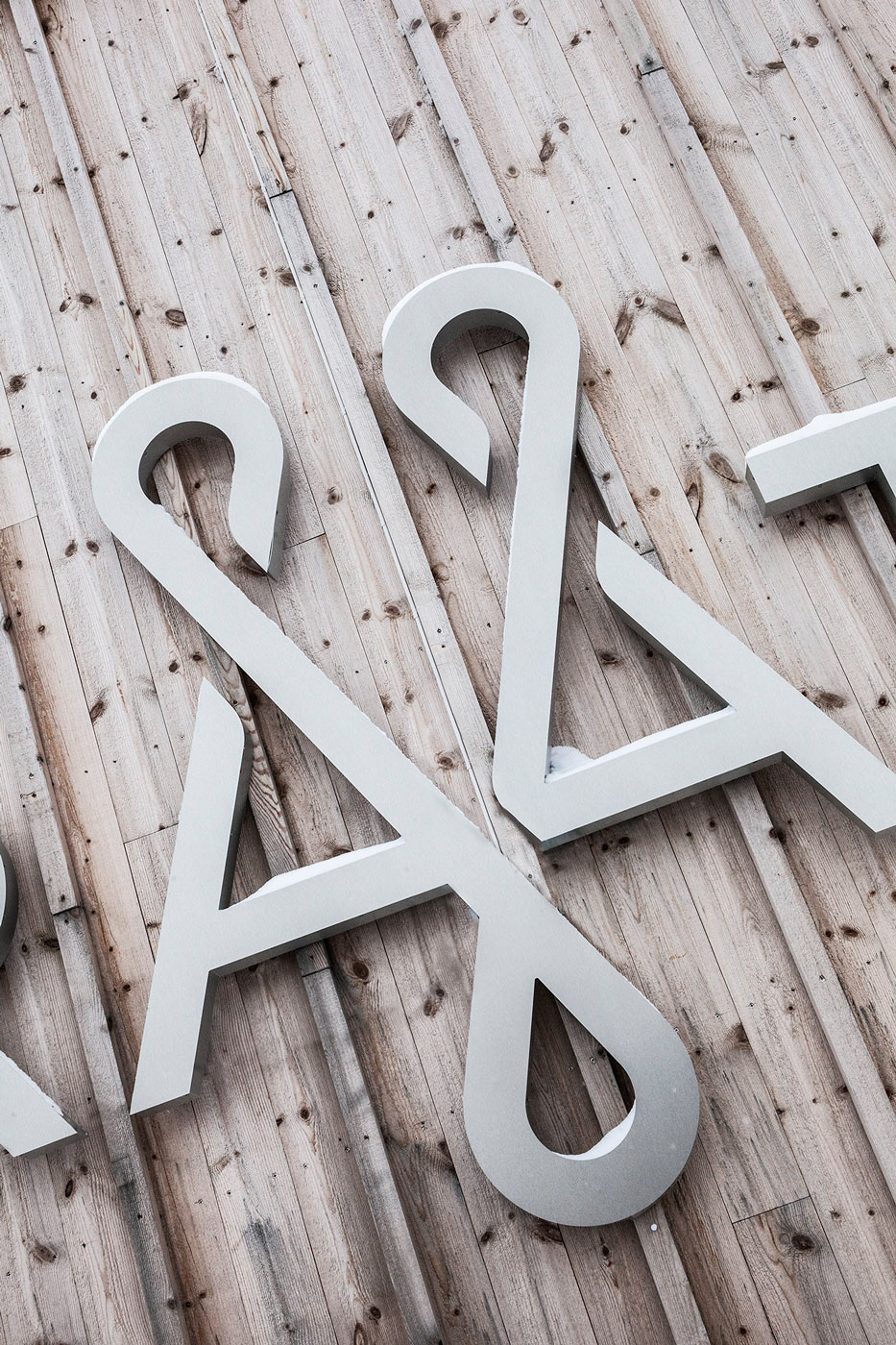
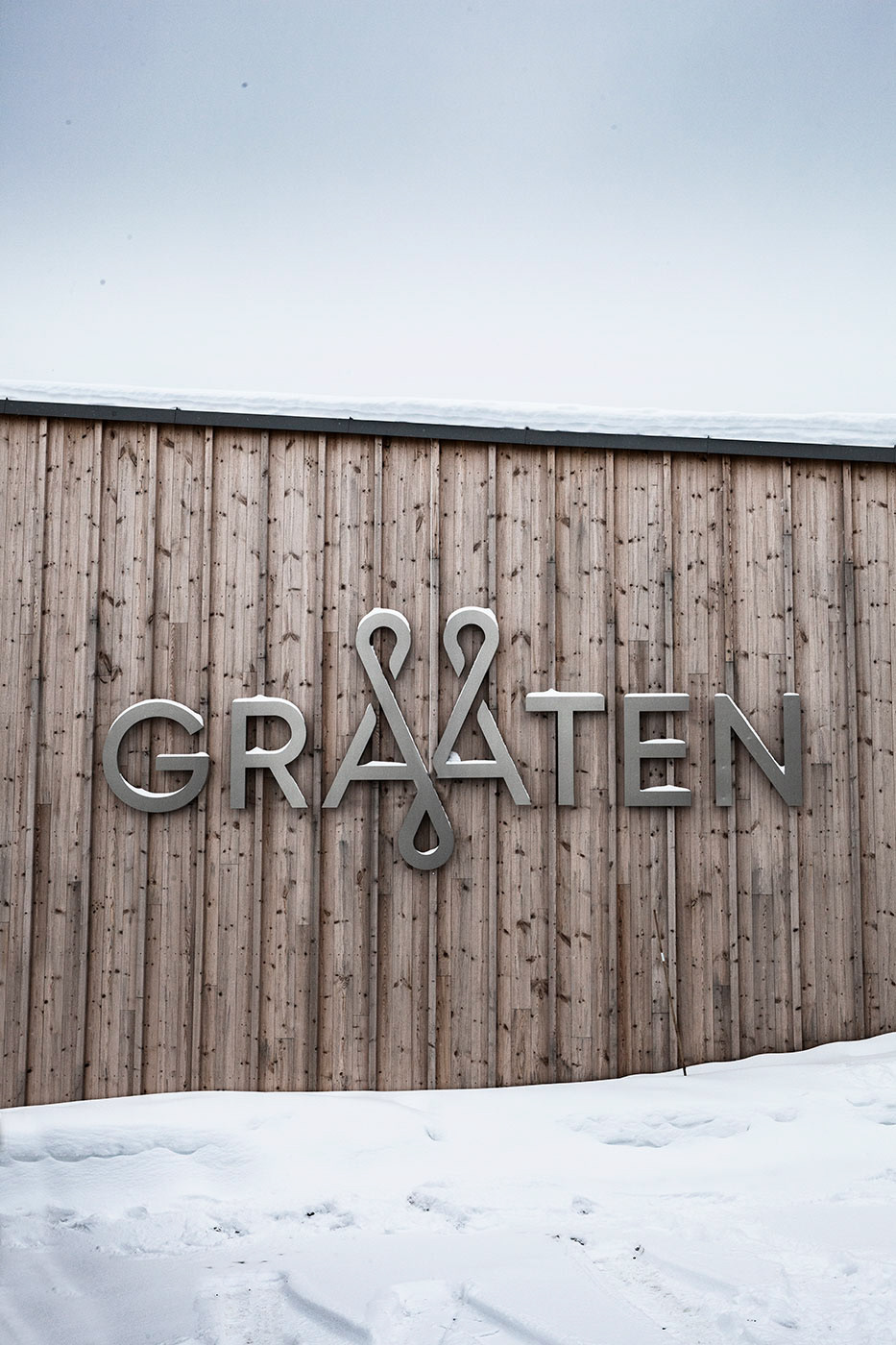
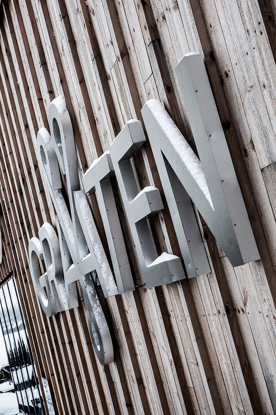
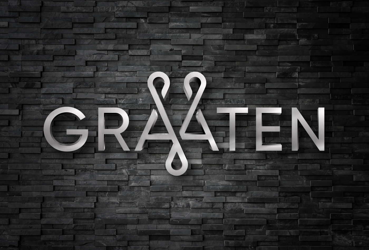
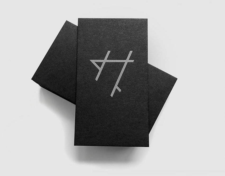
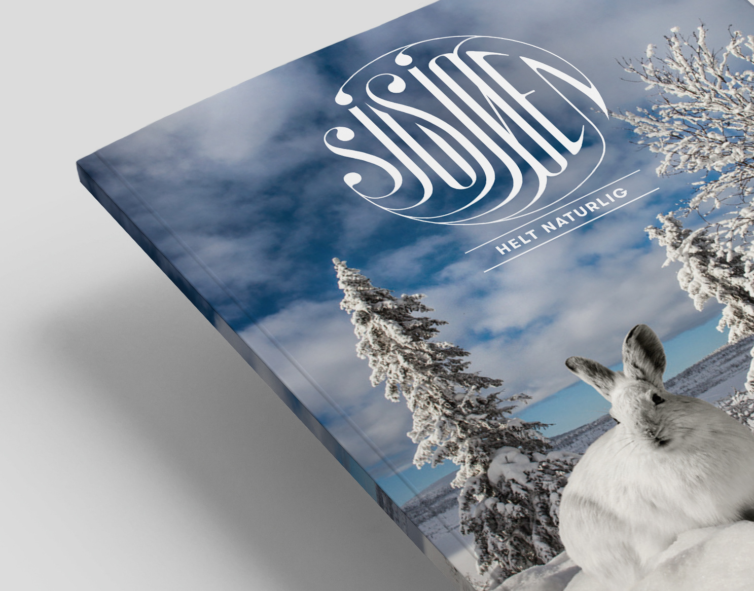
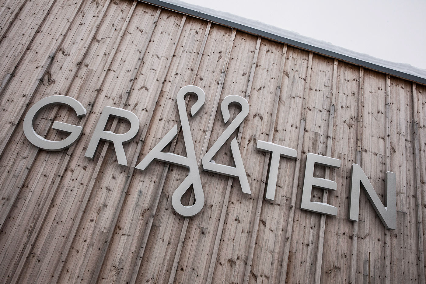
Det nye Graaten-logoet har én fot i fortiden og én i nåtiden/fremtiden; symbolet som inneholder de doble A-ene er inspirert av tradisjonelle treskjæringer og dekorative mønstre som ble etterlatt på rørt smør og ost. Kombinasjonen av de to A-ene symboliserer hvordan naturen og menneskene er knyttet sammen. Og, nederst, en vanndråpe for å symbolisere den vakre innsjøen som Sjusjøen har sitt navn fra. Imidlertid er formen på symbolet og typografien gjort på en måte som reflekterer noe nytt og moderne.
Som furutreet brukt på de nye Graaten-bygningene, slik det ble brukt på tusen år gamle stavkirker, håper vi at dette logoet vil stå tidens prøve.
Foto: Andreas Bache-Wiig (Hesthest Kreativt studio)
Graaten har vært et knutepunkt for handel og et sted for skiløpere og turister å få seg en rask matbit siden 1930-tallet. Opprinnelig var det en seter, der bøndene pleide å bringe buskapen sin om sommeren for å melke dem etter en dag med beite i fjellbeitene.
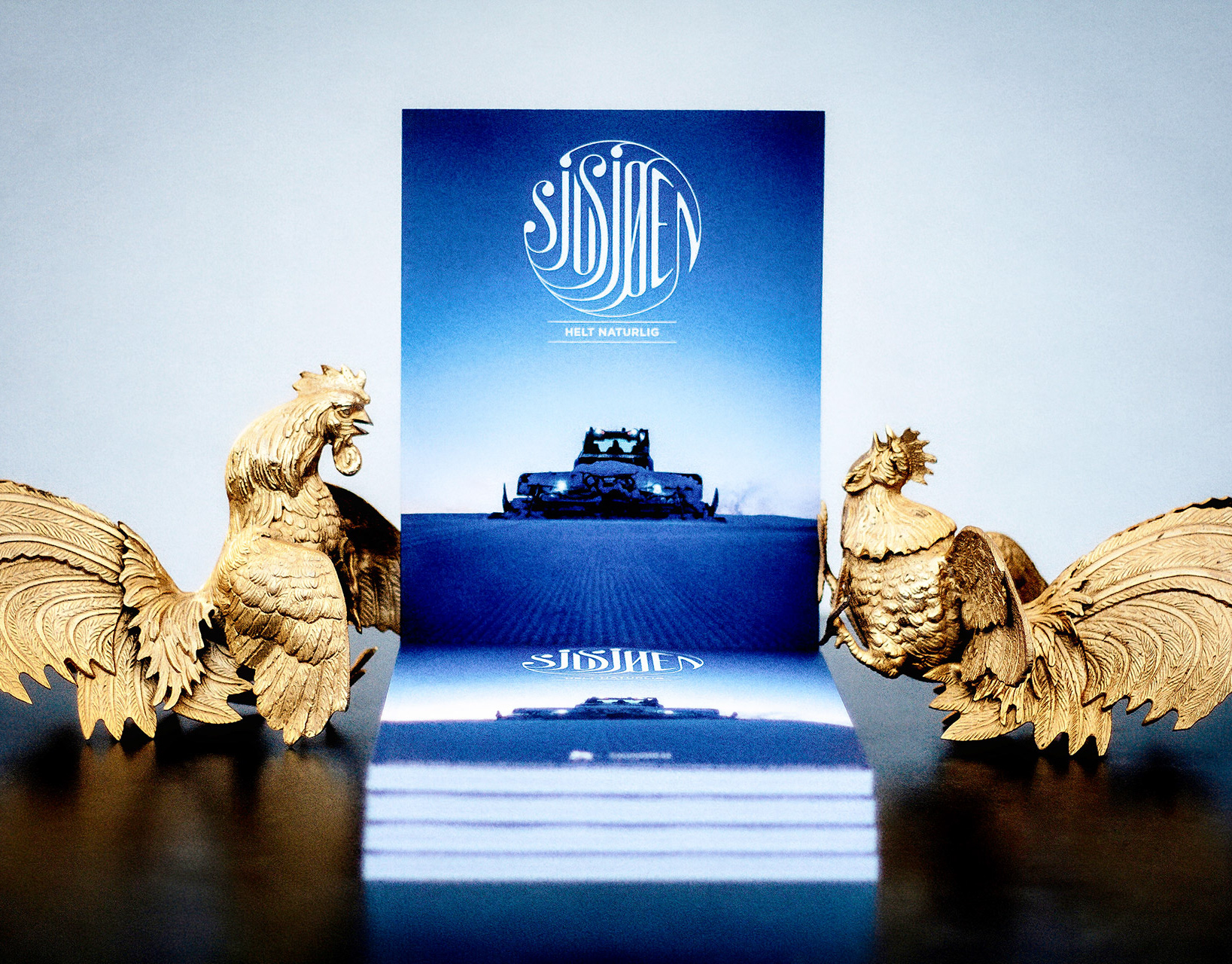
Det nye Graaten-logoet har én fot i fortiden og én i nåtiden/fremtiden; symbolet som inneholder de doble A-ene er inspirert av tradisjonelle treskjæringer og dekorative mønstre som ble etterlatt på rørt smør og ost. Kombinasjonen av de to A-ene symboliserer hvordan naturen og menneskene er knyttet sammen. Og, nederst, en vanndråpe for å symbolisere den vakre innsjøen som Sjusjøen har sitt navn fra. Imidlertid er formen på symbolet og typografien gjort på en måte som reflekterer noe nytt og moderne.
Som furutreet brukt på de nye Graaten-bygningene, slik det ble brukt på tusen år gamle stavkirker, håper vi at dette logoet vil stå tidens prøve.
Foto: Andreas Bache-Wiig (Hesthest Kreativt studio)